Starting from the premise that Rostul is built, the founders of the workshops aim to bring a new concept, based on science and well-being.
The ROST project is a special one for us: from the personalized illustrations and animations, to the multilingual structure.
The versions
×
×
×
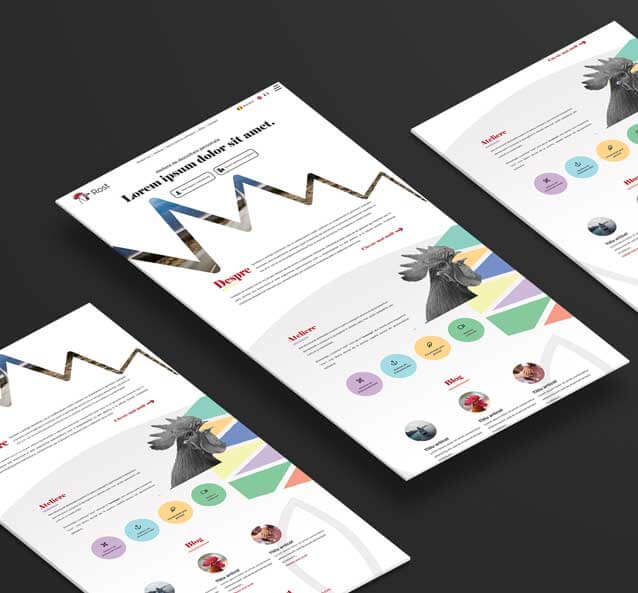
The project
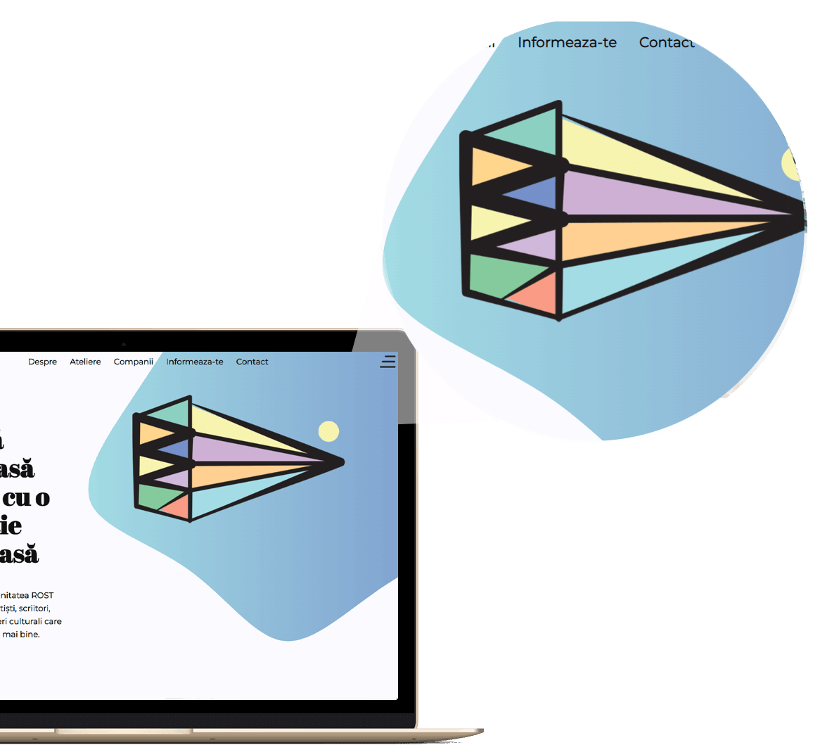
01.Variable width The lines that make up the decorative element have a varied thickness, which suggests the plane in space
03.Lizible font The chosen font is a minimalistic and sufficient sans-serif.
02.Geometric The wavy line is interrupted for a geometric element, characterized by straight segments
The ROST logo depicts a rooster with a diamond beak, suggesting speech as the main asset of the manifestation of consciousness.
x
Light gray The basic color, interrupted in places by the white watermark of the logo
Cornflower Blue Used to create subtle gradients and subtle differences
Black Used for text bodies, it ensures increased readability
Medium gray Used in photos, it highlights the color of the illustrations
Sky blue Basic color, suggests relaxation and peace
x
Playfair Display
Chosen for its serious character, it is used in titles and highlighted sections of the text.
Montserat
An elongated and thin font, compliments the font chosen for the titles and provides readability to the text bodies.
x
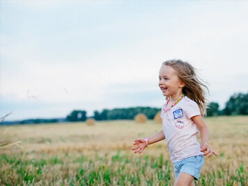
The moodboard is composed of suggestive images for the ROST workshops.
From Hero Images, to frames with sophisticated buildings, this is enough to suggest the diversity of the studios.
The site
Discreet animations
The illustrations in the header of the pages have a discrete hover effect, which, together with the blue fluid shapes, send with the thought of floating, relaxation.
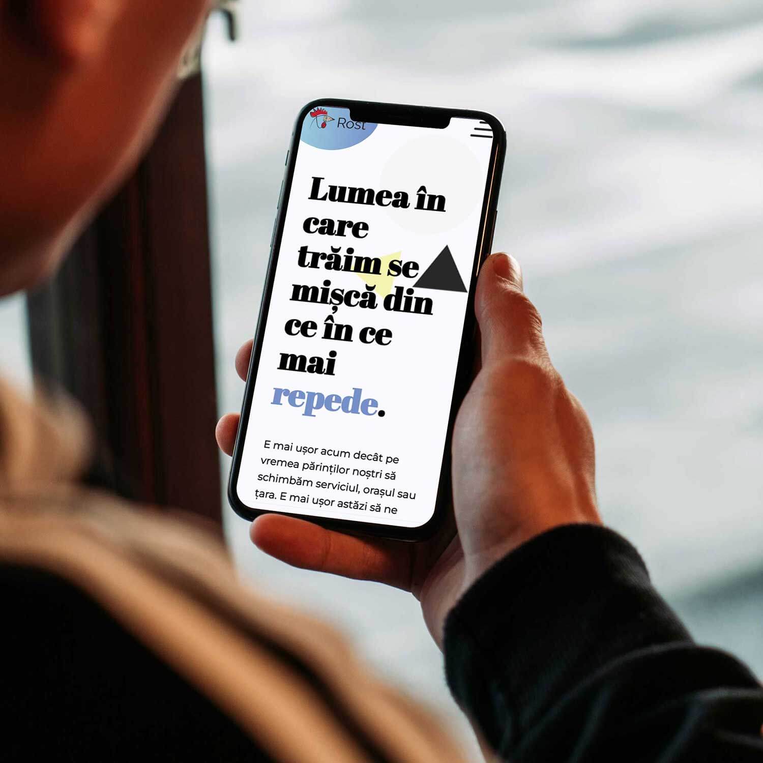
Bold affirmations
Here and there we find fragments of text highlighted by the serif font, with the role of attracting attention and imprinting itself on the viewer's mind.
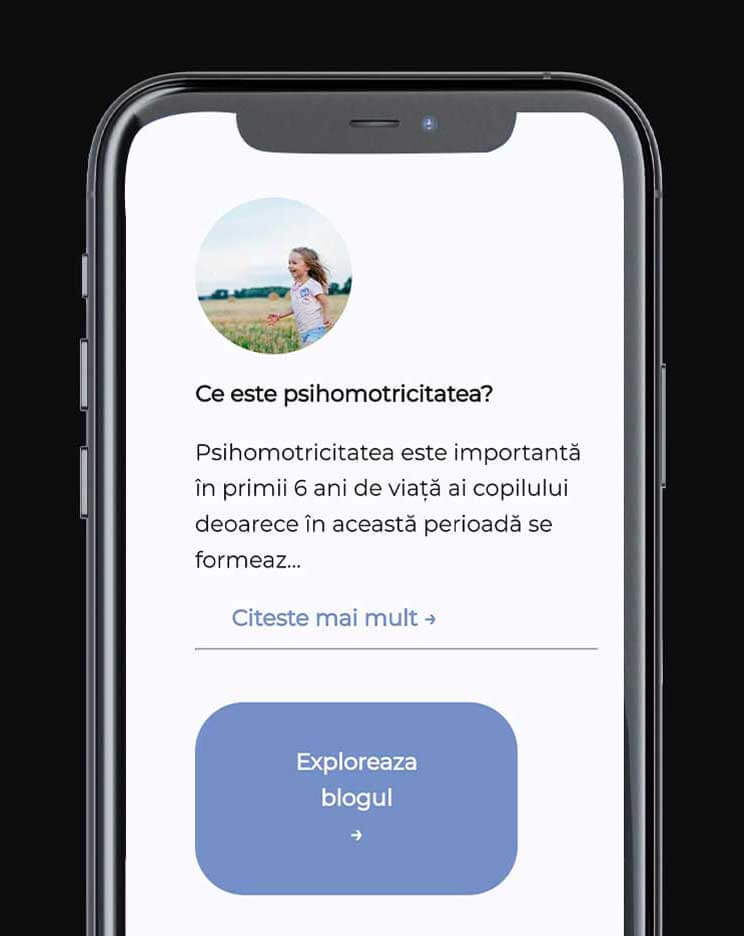
Informational
The latest articles can be found on the first page, encouraging visitors to explore the informational resources
Open
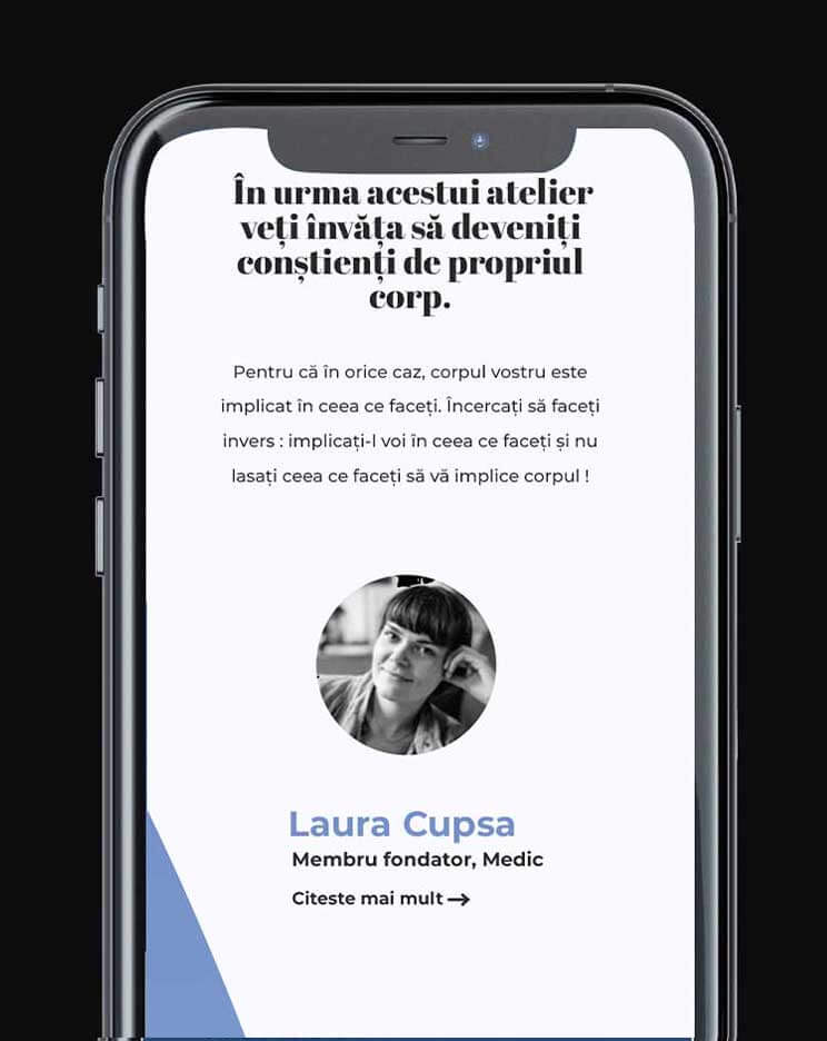
The two founders, together with their collaborators, have a space dedicated to descriptions on the first page. Each of them has a modal for description, the reason for involvement in the initiative and the personal CV.
Ergonomic
Where the descriptions are longer than a paragraph, they are initially hidden so as not to occupy an entire length of the screen.
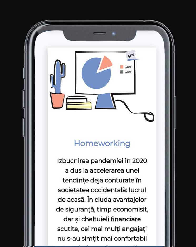
Illustrative
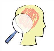
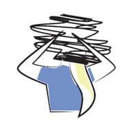
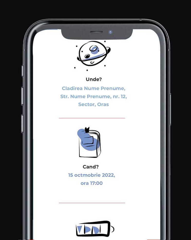
For each of the ROST workshops, we created our own illustrations, designed to strengthen brand associations.
Detailed
The workshop pages also include a description of the workshop author, along with his CV.
Easy to follow
Once the details of a workshop are established, they will appear alongside suggestive illustrations.
More languages
The website is translated into English and French, each version having distinct content - for example, only certain workshops are published in one language version.
The challenge was dynamic SEO optimization, depending on the content - both by defining alternative versions and by automatically generating the global Sitemap.