A unique writer with a complex and fascinating personality, like her writings, Sofia has experienced several artistic branches to develop her creative side.
There is no doubt that such a project deserves a unique presentation site . From the style chosen for design to the possibility for visitors to request signed copies of Sofias books, this is one of the most dear new projects.
The project
01.Accentuated The focus on the name strengthens the idea of a personal brand.
03.Simple The thickness of the line for the writers name complements the composition, being in open dialogue with the thickness of the signature part of the brand.
02.Personal Using the writers signature, we offer a plus of personality to the brand.
The central element of the logo of Sofia is her signature, which gives a well-deserved personal touch to the composition. For the name, we chose a simple font, and the accent falls on the surname to strengthen the personal note.
x
White Light color, used for contrast.
Intense black Mysterious, like the fascinating personality of Sofia - is the base tone of the site.
Powdered marsala Romantic color reminiscent of the shades of dry roses.
Petrolleum blue Creates a nice contrast with the marsala tone, inviting it to a dialogue of contraries.
Medium grey Pleasant in combination with black, used to create contrast and provide a modern air.
x
Raleway Bold
Selected for its wide and friendly character, but also for the large amount of detail for a sans serif font, it compliments the decorative line associated with titles.
Raleway Thin
Selected because the thin character does not tire the eyes in the dark background, but also for the pleasant filling with the font chosen for titles.
x
Inspired, obviously from the subject of activity, but also from the style of the covers of books published by Sofia, the moodboard has a romantic allure, remembering the scenography of the noir films.
Last but not least, the effervescent personality and elegance of Sofia have served as a source of inspiration for this project.
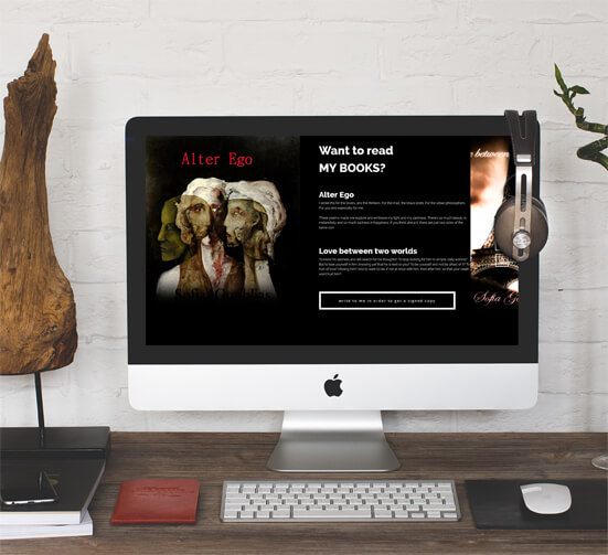
The site
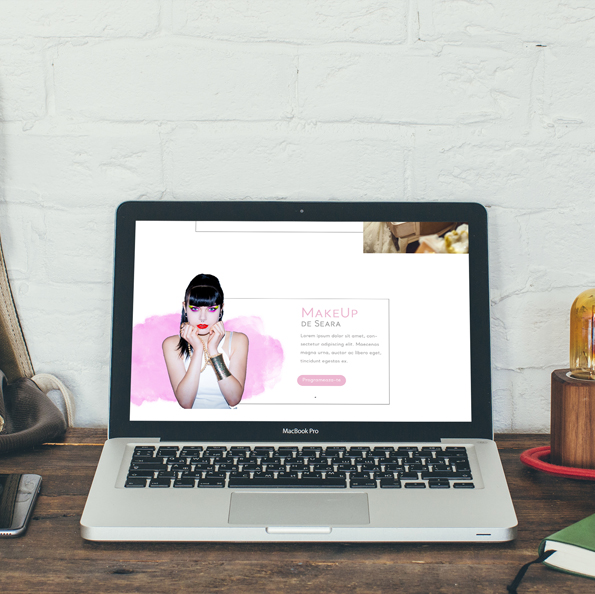
Personal and artistic
How could it be different? The Presentation site made for Sofia includes suggestive illustrations and photos, in a rhythmic format that reminds of the effervescence of her personality.
Romantic
In honor of one of her personal features, the contact area uses a romantic photo and suggestive text, encouraging visitors to send a message.
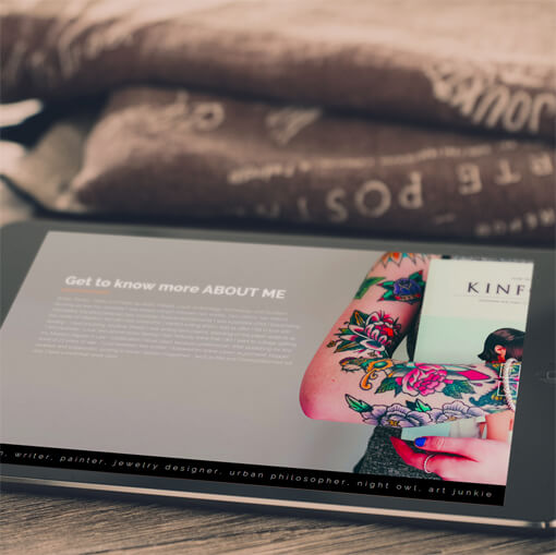
Contrasting
The "Work in progress" section uses a white background to create a strong contrast to the rest of the site, but also to suggest the writers struggle with an empty sheet. Sophias photography is built under the eyes of the viewers, reinforcing the idea of creation.