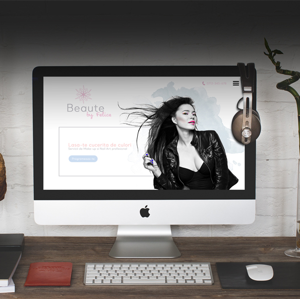
A trendy make-up and nail art salon, built from passion for the two disciplines, deserves - we say - a special presentation.
The presentation website of the salon celebrates the feminine in all its forms, inviting the viewers to exuberance. The Fold sends viewers to dreaming, emphasizing one of the salons distinctive advantages - the color.
The project
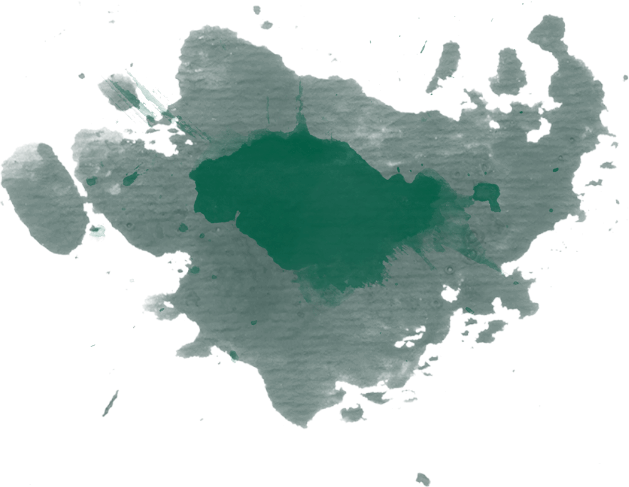
01.Elegant The lightweight 3D watermark reminds of the gradients applied to the colors in Make-Up
02.Personal The phrase "by Felice" is integrated as a signature
03.Airy Highlighting the object of activity
Feminine, personal and detailed, the logo suggests the complexity of the field of activity.
x
White The basic tone of the site allows the eyes to relax;
Medium gray Selected to compliment the palette and for its temperated attitude;
Powdered rose Associated spontaneously with femininity, powdered pink is a choice that strengthens the definition of the target market;
Peach A tone close to that of the skin, the fad orange is at the middle of the chromatic palette - being visually close to pink and complementary to blue;
Baby blue Associated with relaxation and well-being, the role of blue in the chromatic palette is to emphasize the feminine character of pink by juxtaposing;
x
Montserrat thin
With a sleek, elegant profile, Montserrat is an easy-to-read font that suits the textbodies. The slimline, combined with the font for titles, balances the composition.
Montserrat
The Smallcaps variant used for titles and various textbodies gives a romantic air to the content.
x
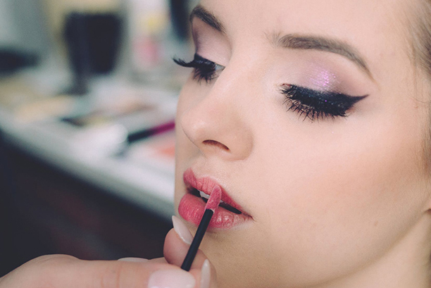
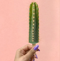
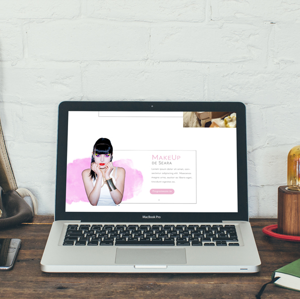
Inspired by the object of activity, but also from the proposed differentiation, the moodboard of the project is brightly colored, giving the direction for the photography types used.
The second component of the moodboard is the frames illustrating the exuberance of feminity, joy and relaxation.
The site
Decorative
The decorative watermark present in the logo is reinterpreted to trim the section endings, reminding the brand and giving an elegant air to the composition.
Balanced
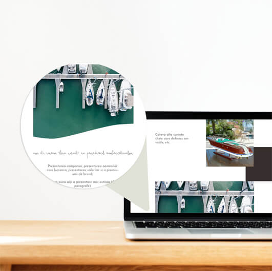
The chosen compositional formula uses borders to direct the eyes of the viewers over the texts, and overlaps suggestive images - illustrating each category of service. Thus, the layout of the site is homogeneous, the service presentations following the known pattern, interrupted by impact panels with strong chromatic differentiation.
Contrasting
If the color palette built untill here is based on the white background, the offers section uses a dark background that draws attention to it and strengthens the idea of premium services.
Ready to communicate
The Newsletter subscription form is integrated into the offers section to take advantage of the interest shown by visitors who have navigated to that section. Thus, if they are interested in promotional offers and packages, they are given the opportunity to be personally notified when new offers appear.