A prestige brand, brought back to life in our days has two tasks to fullfill: to arouse the melancholy of connoisseurs and to prove its evolution, adapted to the current world.
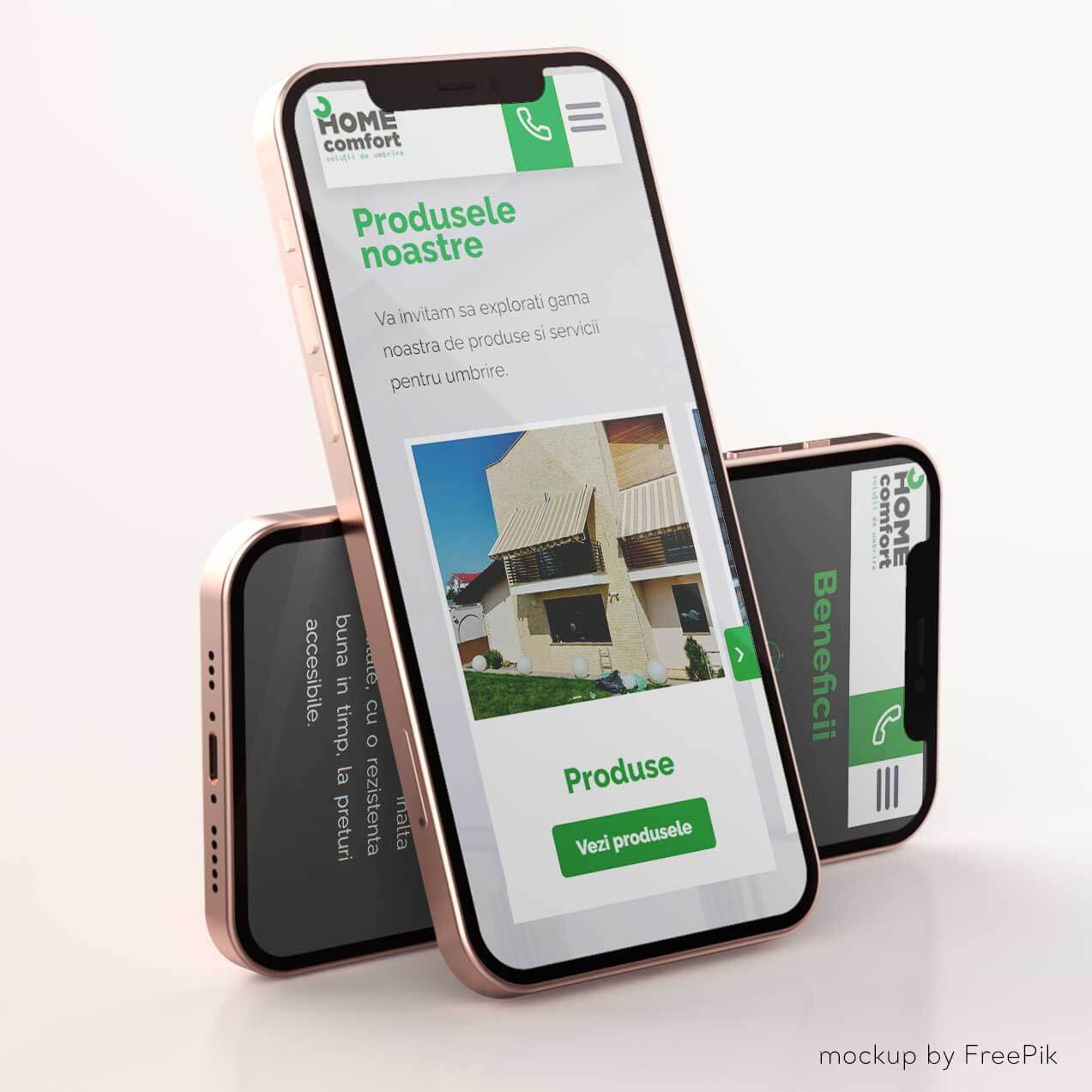
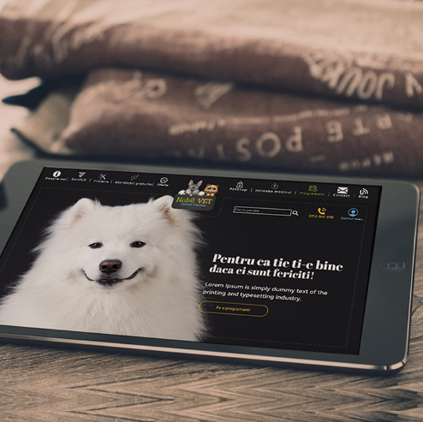
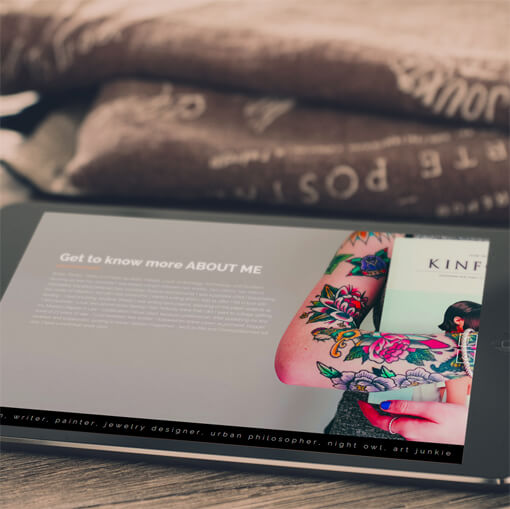
With an obvious professional target, for the B2B, as well as the B2C segments, the presentation website uses short paragraphs, combined with big image panels, in order to retain the focus of the readers and offer them the basis information in a concentrated form.
The project
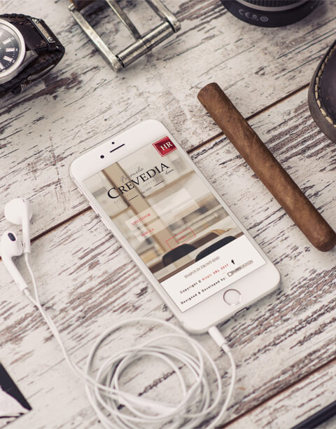
The project started with the rebranding of the known company, signifying the rebirth of the Crevedia chicken.
01.Sharp details Reminiscent of the 50s typographic style.
02.Illustrative In order to emphasize the term ("unique, particular")
03.In time Emphasizing the vintage of the brand
By renouncing the term "Avicola" in the favour of the term "farms", the focus is on the known brand. We wanted to make "Crevedia" the central element of the logo, with the rhytmic font combination surrounding it.
x
Pure white Basis color of the website, allows eyes to rest;
Yellow Stirs the appetite in combination with red tones. Used in small quantities in order to not efface the strong character of the basis colors.
Permanent red Chosen in order to preserve the brand chromatic, its strong character recomends it as a central element in graphic constructions.
Marsala A vintage tone of red, Marsala suggests prestige and age.
Dark green Used to compliment both the red tones and the rose notes of the meat, the dark green suggests the spices used in the Romanian cuisine.
x
Otto
Chosen for its romantic character, it reminds of handwritting, emphasizing the idea of "sincerity". The curve lines, combined with the diagonals contribute to the romantic aspect of this font.
Constantia
With rich arches and sharp details, Constantia reminds of the presses used for the 50s newspapers.
x
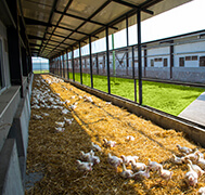
Built from on site shots and food photography, the moodboard alternates non-colors with the chosen chromatic palette.
The food shots use red tones in order to create contrast, and remind of the brands, along with complementary tones that emphasize the key element - the product.
×
×
×
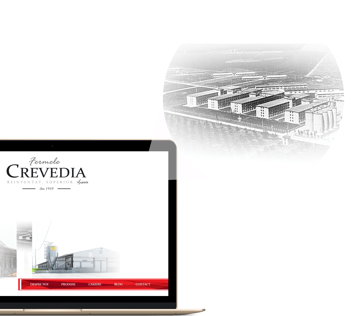
The site
A brand with tradition
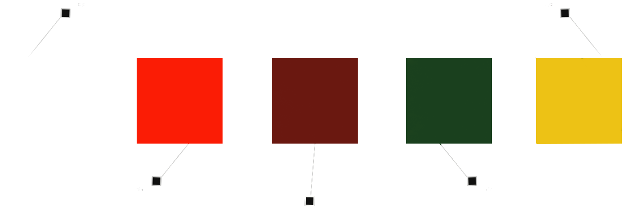
Even from the fold, the site shows visitors that behind the modern farms of today, stands the story of a brand with tradition. The time indicator in the logo is positioned right above, in order to help place exactly in time the moment in which the Crevedia chicken started being produced.
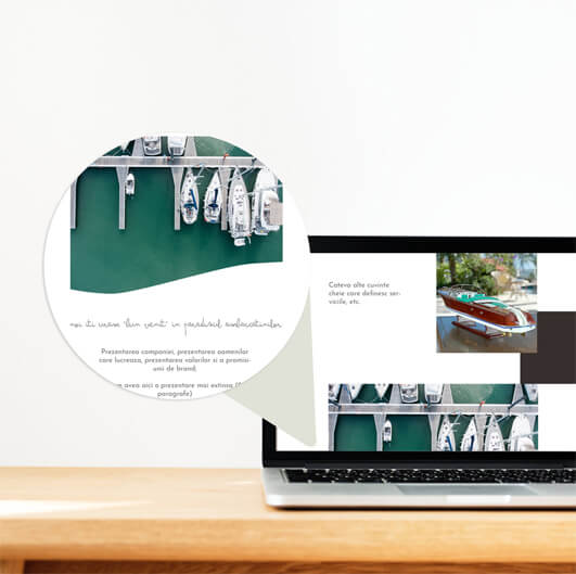
Short introductions
Followed by images that reinforce the affirmations or illustrate concepts, not included in the short introduction. Their alternance creates a navigation experience based on contrast.
Intelligent
The custom integrated HR CMS allows the employees in the HR department to publish, modify or delete the positions available in the company. Those positions that have a high personnel flow can be hidden, in order to be used later.
Initially, the site included a rating system that showed the candidates what chances they stood to be called for an interview, basing on the number of requirements met. The front end did not allow applications from those with less that 70% chance of being selected.
Customer centric
The complaint section places a way of communication with dissatisfied customers and contributes to obtaining their feedback as soon as posible. This way, customers feel important for the company, by always having this concrete channel for communicating their discontent.