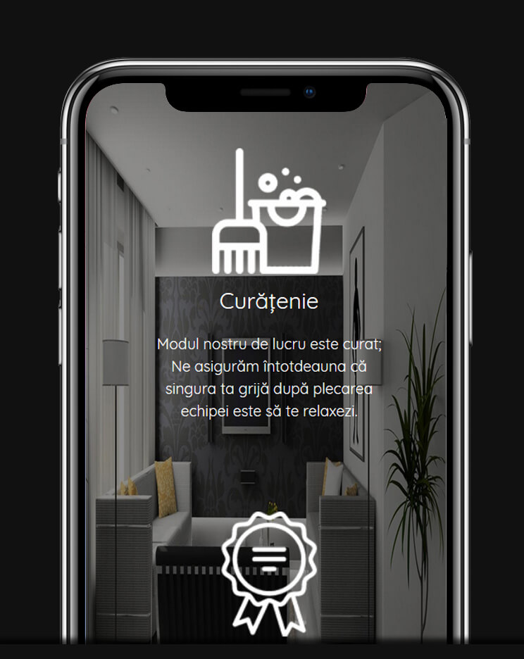
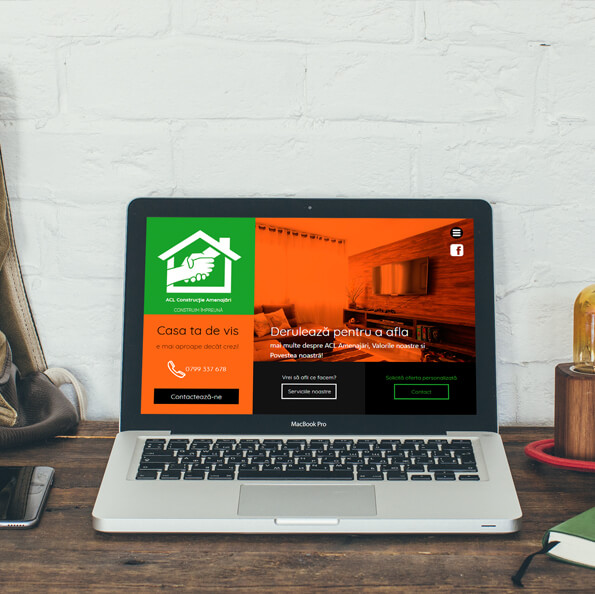
An essential component of interior design is to align the home with the latest trends. Therefore, the presentation site of the design firm is based in all sections on the idea of modern design.
Anticipating also informative searches, the site is designed to monetize these searches as well through specific tools.
The site
xWhite
The basis color, allows the eyes to rest. Associated with the idea of cleanliness.
Medium gray
Achieves a pleasant, bi-directional contrast, contributing to the modern look.
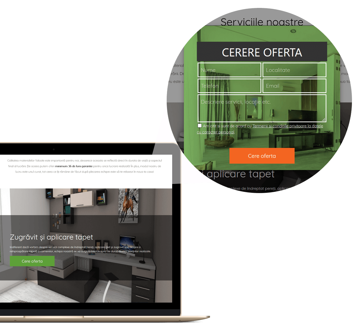
Grass green
The basic color of the brand, associated with nature and affirmative actions.
Intense orange
Sugesting energy and friendship, the orange highlights the lively character of the green.
Black
Contributes to a superior degree of contrast by juxtaposing with the other palette colors, giving a deeper definition of the elements.
Quicksand
Elected for its elegant character and superior legibility, alternation with the light version creates a rhythmic dialogue.
Quicksand Light
The slim character has a modern air, taking advantage of the kerning trends.
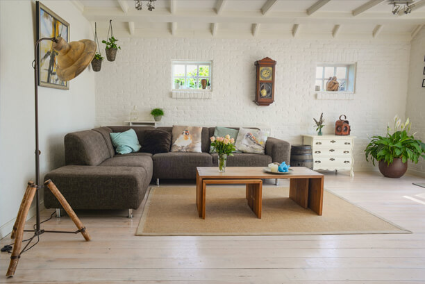
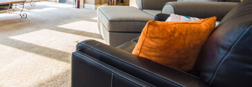
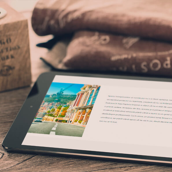
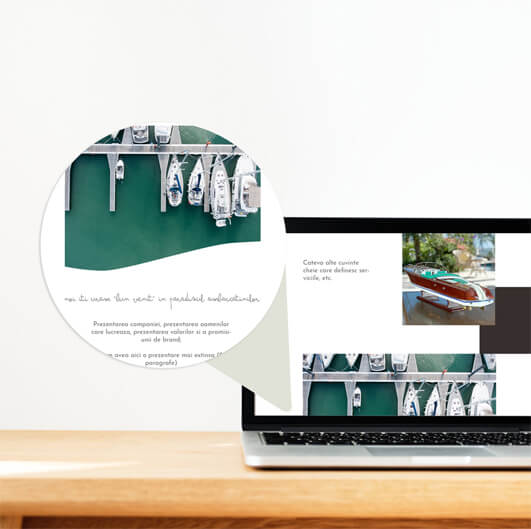
The Moodboard combines interior frames, modern details and finishes with city images exploring the straight architectural angles, as well as baroque detailing.
Whether it is a classic, minimalist or industrial style, elegance and refinement should not be missed. Therefore, image selection combines different styles in wide or detailed frames.
Created for results
By placing the "Request offer" buttons right after the short presentation of the services, we ensure that visitors have the shortest route from the service page to contact. Pop-up forms allow resuming the navigation by making the offer request less invasive than loading a new page.
Card layout
Suggesting rigorousness and seriousness, illustrates the various categories of services, but also a pleasant flow of pages. The alternation between white sections, photo panels and colored sections allows exploiting the psychological potential of chosen colors.
Impact Photography
Because we are in a predominantly visual area, the site uses white background areas alternating with large photo panels to create a web experience based on contrast.
Ready to communicate
The placement of the newsletter registration form pretty high on the front page, immediately after the company description has the role of collecting the contact details of those users who are not yet ready to renovate. Its positioning after a white portion draws attention, the form having collected records even during periods when no promotional budget was allocated.
"Throughout the project, we have had effective communication, promptness and professionalism in fulfilling all the tasks, which led to achieving our goals in a timely manner."
WRITE US!
AND LET'S SEE HOW CAN WE BUILD A SUCCESS STORY TOGETHER.