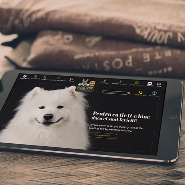
Website with integrated bookings software - Piatra Graitoare
A guesthouse built by a cruise ship croupier, welcoming tourists with fascinating stories and helping them explore the beauties of the Apuseni, deserves - we say - a special website with integrated bookings software.
One of the features of this tourist destination is the multitude of objectives, suitable for any season. That is why we created for the Piatra Graitoare guesthouse a presentation site that changes its appearance every season.
The project
01.Cardinal The symbol of adventure, also found at the entrance, suggests one of the benefits of the guesthouse, the history and stimulates recognition.
02.High readability Spatiated, in order to easily identify the object of activity and location.
03.Manual font For a personal touch, suitable for the brand
The central symbol of the brand, The cardinal, is a symbol used in navigation - you understand, therefore, where did the choice come from, for our croupiers guesthouse. Its positioning at the entrance facilitates street-level recognition, while the combination of fonts enriches an otherwise simplistic symbol. Positioning of the guesthouse at the starting point of many mountain trails comes as an additional argument for using this symbol.
x
White The basis color, allows the eyes to relax.
Lilac/Powdered Rose Color inspired by the flowers on the vf. Bihor, treated so as to suggest freshness of spring.
Pine green Inspired, obviously, from forests, green throughout the year, the color reflects the colorful experience of the Apuseni.
Ceruleum The fresh snow in the Apuseni reflects the sky, resulting in a cool but sweet blue tone. Not small was our surprise to discover this after the first photo session at Piatra Graitoare guesthouse.
Dark sepia Earth nuance, found in tree stems, its neutral character compliments the chromatic palette.
x
Allura
With a profound personal character and diagonal profiles, Allura is suitable for titles combining handwriting with readability.
Montserat
Choosed for the wide profile, and for enhanced readability, Montserat does not distract from the content written using it.
x
The basic feeling of the moodboard is adventure. Whether we are talking about hero shots, landscapes that embark on exploration or simply the beauty of nature, adventure is the key word in the images used.
Alternatively, the frames suggesting relaxation are included in the moodboard, because a vacation at Piatra Graitoare guesthouse combines the adventure with a superior degree of comfort and relaxation.
The site
Weather-sensing
A winter snowflake, a spring cherry blossom, the Summer Sun and a golden leaf in fall, with chromatic palettes tailored to each season, elements that decorate the site of the guesthouse according to the season.
Illustrative
The images included in the site are also weather-sensitive, alternating depending on the season. The flow of the site is delicate, alternating white text panels with large impact photo panels.
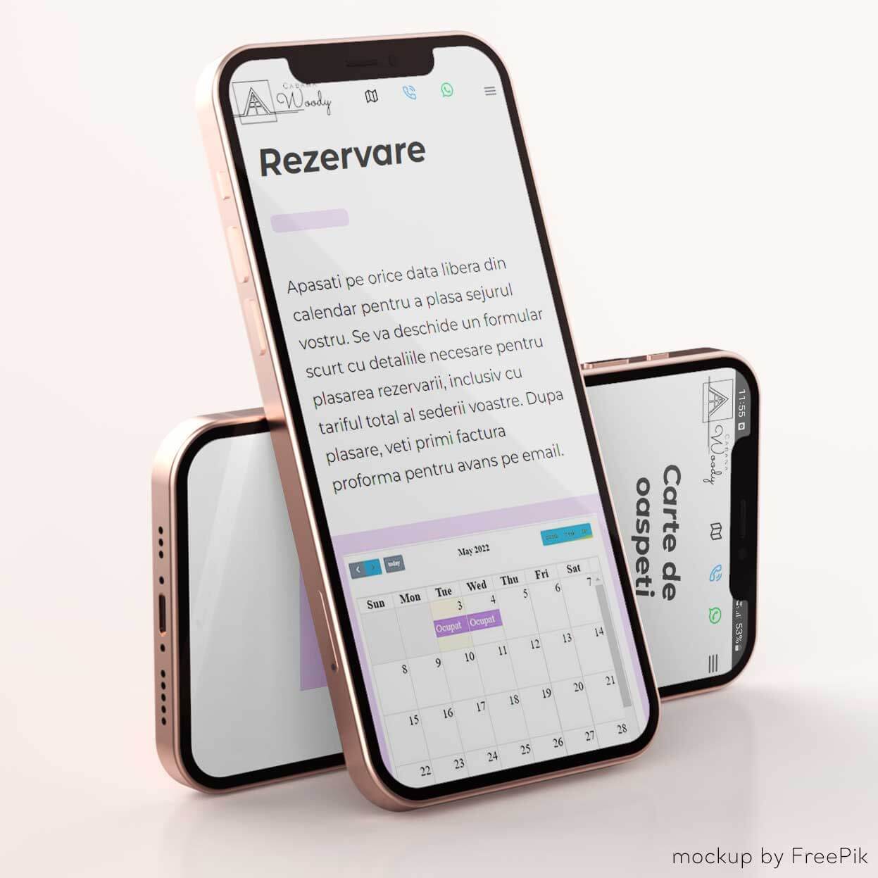
Real time availability check
Tourists can check the availability directly on the site and place reservations that will occupy the rooms in real time.
Intelligent
In the Back-end, receptionists can check reservations, place, modify or cancel reservations (which occupy or release the rooms on the booking page) and see the occupancy rate on the calendar, globally - for the whole guesthouse - or for each room individually.
Independent
Price updates can be made in real-time from Back-End, using an intuitive form, of course mobile optimized.
"We managed in a relatively short period of time to make ourselves seen and heard by thousands of people and some even contacted us for bookings, that inevitably contributed to our profits."
WRITE US!
AND LET'S SEE HOW CAN WE BUILD A SUCCESS STORY TOGETHER.
×
works
n
Ghencea Residence
A unique detailed website for a real estate company.