GDPR Policy
Cookie Policy


 x
x
Mobile 1st - websites though for mobile
In a world where unlimited data is no longer a beautiful dream, and anyone who has the internet in the pocket, optimizing a website for mobile devices is no longer enough.
The Mobile First principle, developed somewhere in 2013, involves prioritizing mobile devices in designing websites, taking into account the particularities of these devices.
We think it is safe to assume that
The first impresion is delivered by your mobile site.
So why would you start from a version initially thought for desktop?

What does Mobile First means for us?
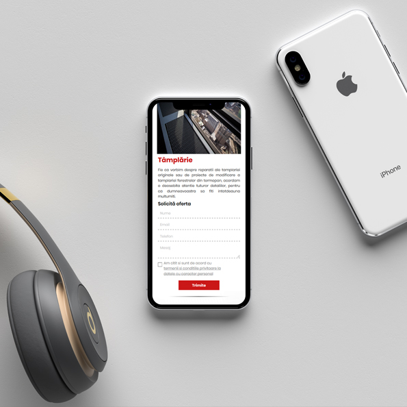
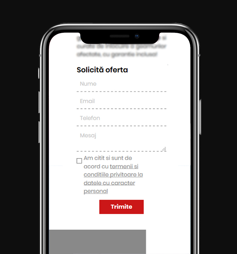
Functional CTAs and ease of action
How many times have you been searching for a quick contact or address on a site? If you did not find what you were looking for in a timely manner, it certainly was not a DUMS site.
Our projects are designed to ease and assist mobile navigation. Thus, phone numbers are always callable, the maps are replaced by buttons that open the navigation to the location - with any application on the visitors phone, the Whatsapp buttons open the message window, and the most important ones are accessible in any screen.

Single hand usage
Even if we are talking about a 6-inch display, who uses the phone with both hands?
Lisibility
Every body of text is inspected to be legible even on the smallest screens (4.5 inches). Thus, we ensure that, in addition to persuasiveness, more importantly, text bodies can be read.

Click/Tap Surface
If you have a precise cursor on your desktop, on your touchscreen device the contact area is much larger, being normalized to an average of 7mm. In relation to the small size of the displays, the active elements have to occupy a larger surface to avoid accidental clicks.
Ergonomy
The reduced screen size of mobile devices requires the vertical organization of information. Thus, users have to stroll through the pages, scrolling them vertically - often passing through information that is not relevant to them.
Ergonomy can help prevent boredom from visitors. It means to show the availability of information and to ask for action from those interested, without obliging those uninterested to go through it.

Intuitive navigation
A clear and clean structure is essential for a complete web experience, assisting visitors and pointing to the next step. From fixed menus, page and link names, and to traffic targeting, all navigation items are carefully inspected to be intuitive.

Loading speed
Last but not least, load speed affects the visitor experience and has a strong impact on the success of a web page. By always developing custom sites, we get short loading times, thanks to the reduced amount of code required for proper operation.


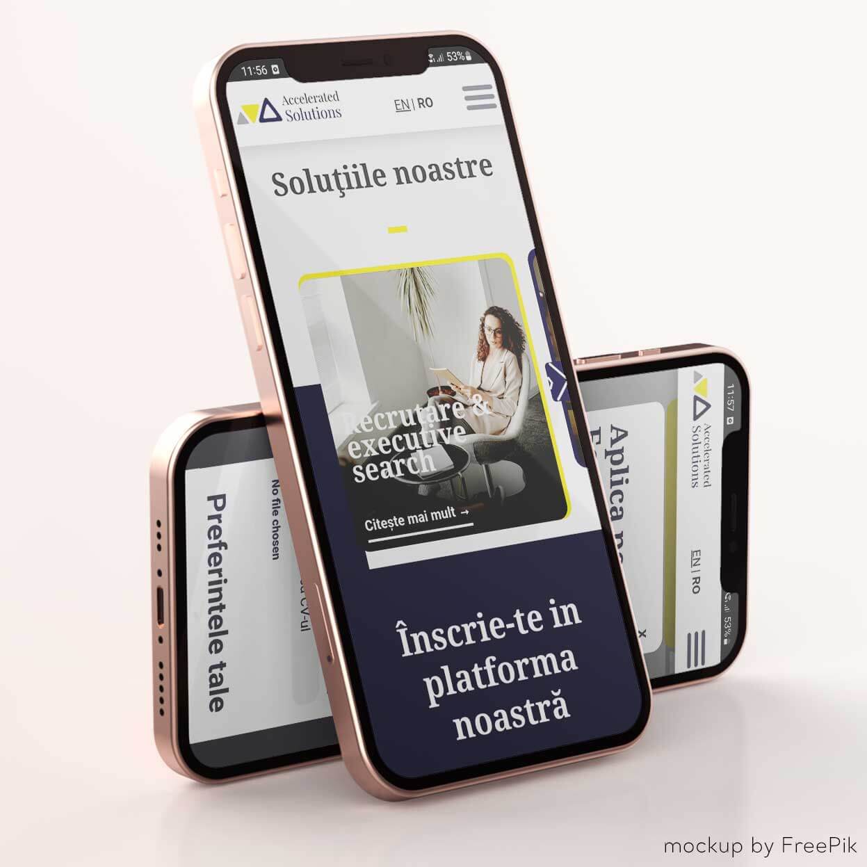
 For example
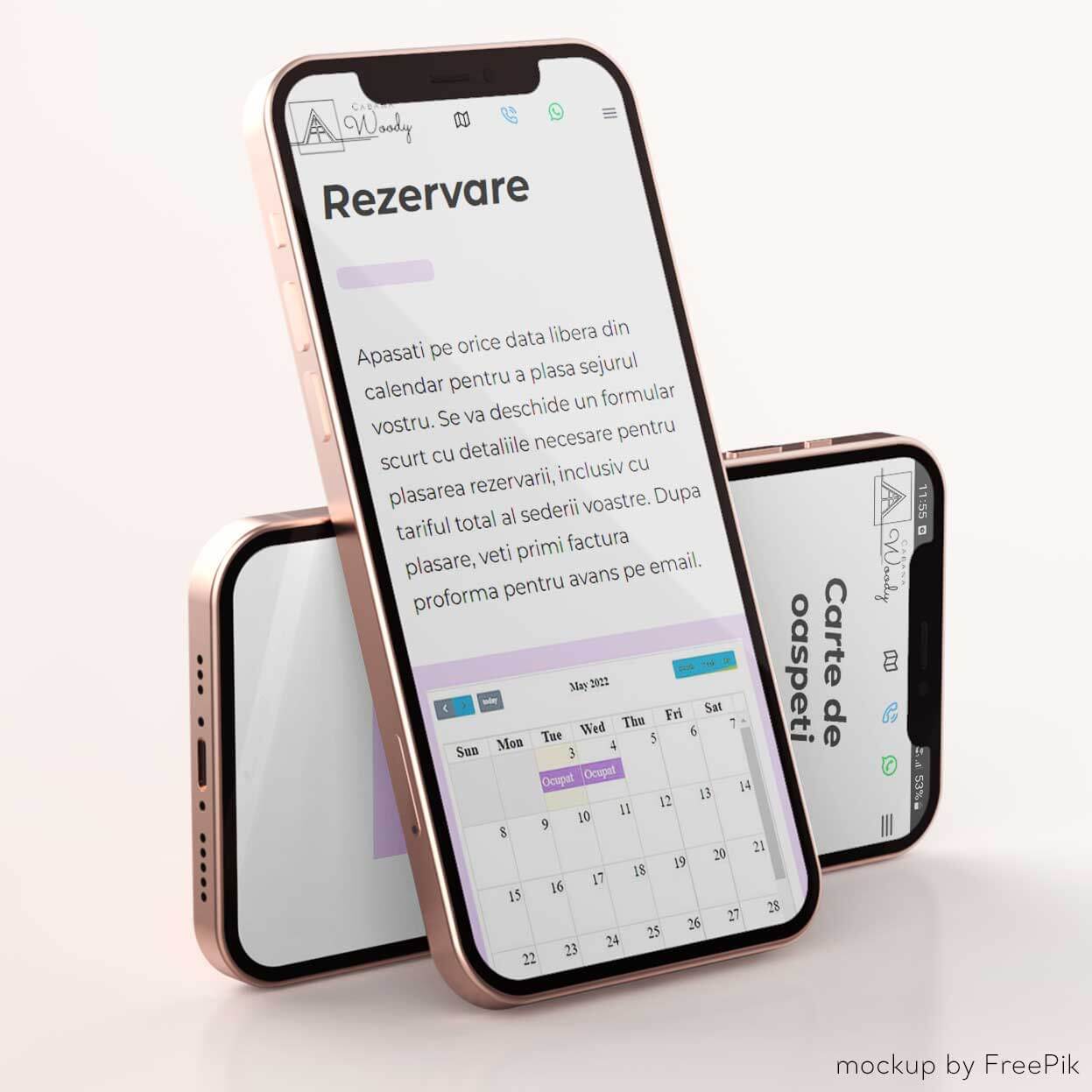