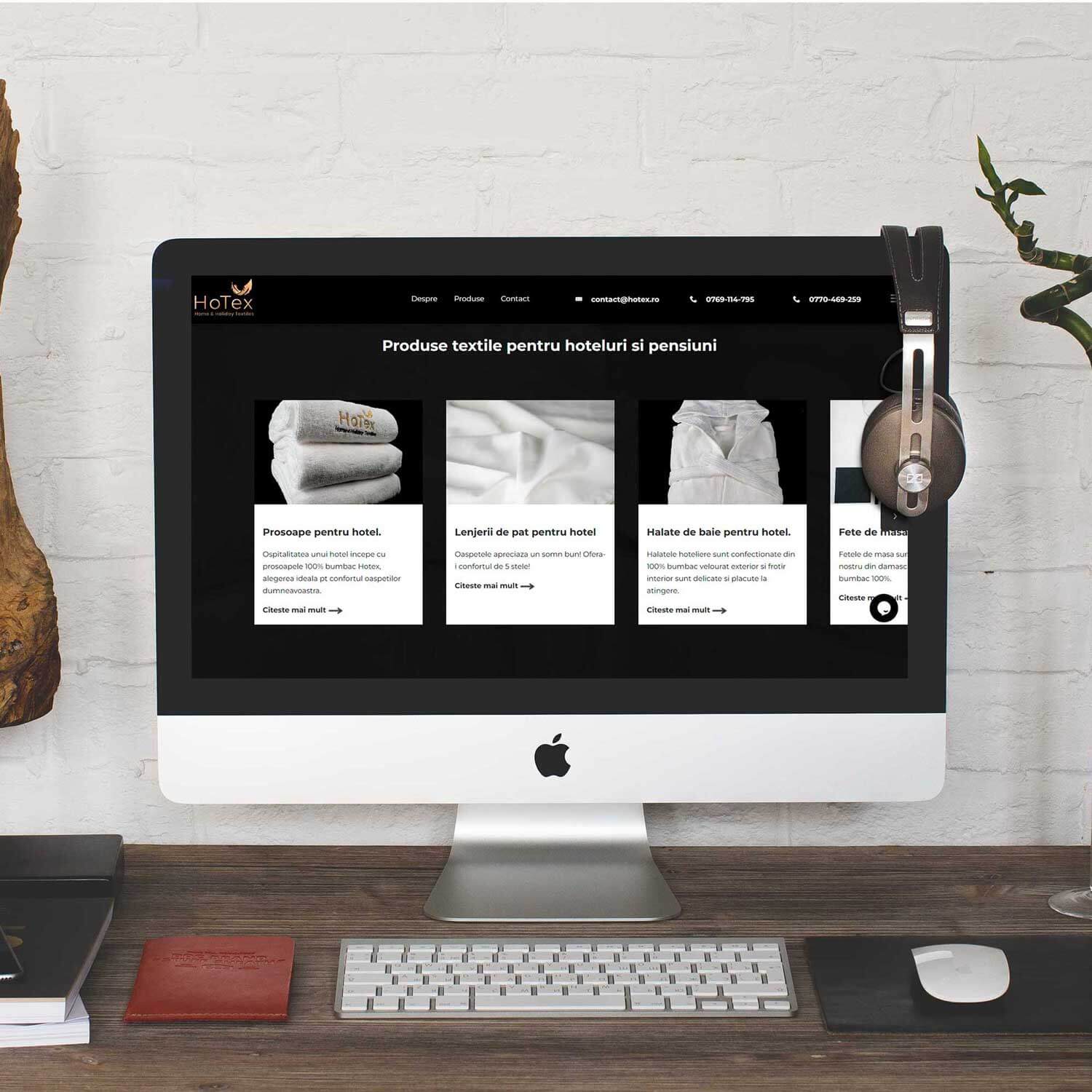
An online store for a B2B audience will always meet the need for the visitor to have access to the relevant information for the decision process - from specifications, to delivery terms and price, the B2B visitor involves a lot more factors in decision making than the consumer.
Creating this online store has been geared toward providing a pleasant experience for visitors, regardless of the device they are using, but also to draw attention to conversion elements, provide information in an organized format, address concerns and convert even the visitors who did not find what they were looking for.
The site
x
White The basic color, allows the eyes to relax.
Grey Often used in B2B applications, the gray tone chosen compliments the strong reds without eclipsing them.
Permanent red Motivated by the branding, red is the primary color used for site elements.
Dark red Used to highlight the harshness of the primary red tone, it allows the eyes to rest on the elements where legibility is essential.
x
Josefin sans
Motivated by the desire to ensure brand consistency, the font has sharp angles that make it difficult to associate with fonts with other features.
Josefin bold
Used to emphasize sections titles, while keeping design consistency.
x
The moodboard is built from images with products similar to those marketed, illustrating professional kitchens.
Alternatively, we use suggestive food photography, evoking the idea of final customer satisfaction.
The product in the foreground
By using the white background, the product photo and the button that takes the visitor into the presentation page are the main items on which the eye falls, ensuring the attention of viewers on the basic elements in the conversion process.
Not just optimized - Mobile Friendly
The diagonal structure in the desktop version is replaced by a vertical structure in the mobile version. Category pages illustrate product types, making it easy to access different sections.
If in the desktop version, the category side menu makes navigation easier, in the mobile version, it would affect the ergonomics of the page, occupying the space where the products are now displayed. Thus, category pages come to ease the navigation and improve the visitor experience on the mobile.
Dedicated to convert
The domain is characterized by a longer decision-making period, which takes into account several decision factors. However, time is essential to any business.
That is why, at the end of each product page, visitors can easily put a question - addressing any blur in the presentation, or taking advantage of the opportunity to personalize the products.
Intuitive administration panel
Both for products, categories, subcategories or brands, and for viewing orders placed on the site.
Add products in 30 seconds
Using only the relevant fields for this online store, adding products can be done in the shortest time possible.
After selecting the category and subcategory, the company employees can select the brand (to display different warranty conditions), enter the product image and specifications table, the pdf page of the manufacturers catalog, the description, but also the price and stock. If the product wants to be displayed with "ask for quotation", it is sufficient to leave the price field empty.
In the case of limited stock promotions, placing the offer price will display the discounted product (old price, new price, discount percent), include it in the "offers" page, and cancel the promotion after the stock has finished.